“Creativity is piercing the mundane to find the Marvelous.”
—Bill Moyers
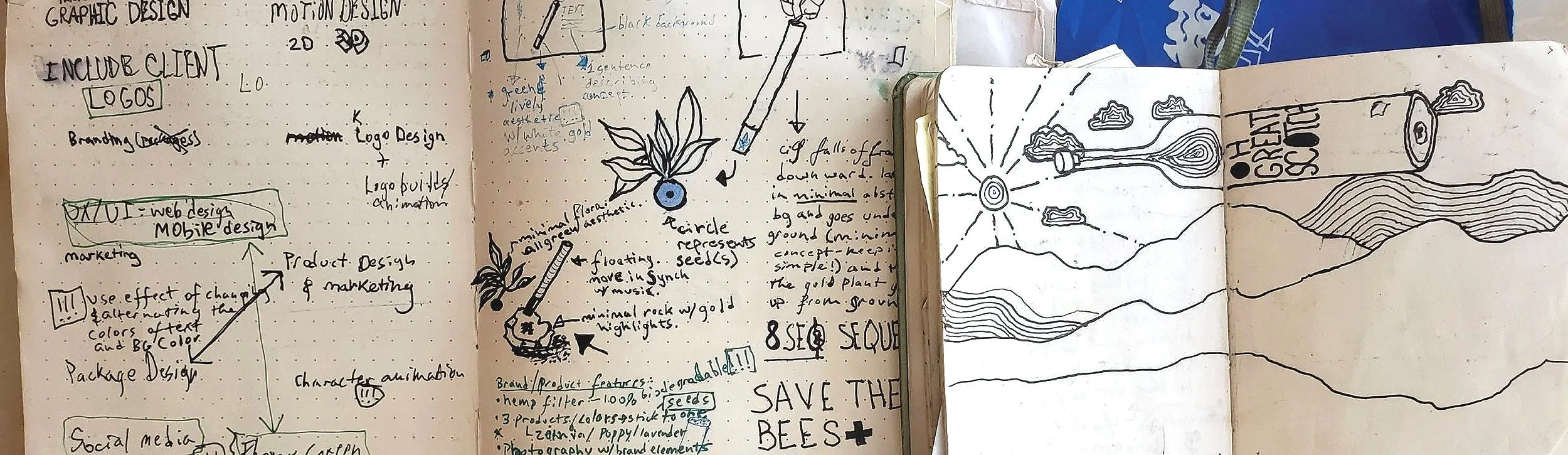
My COMMON PLACE NOTEBOOKS
The concept sketches below are a handful of ideas from my Commonplace Notebooks that are specific to beverage brands and product concepts. Just a few sparks of inspiration that I couldn’t resist jotting down.
(Common Place Notebooks are a tradition handed down from well known writers, makers and creatives throughout the recent centuries. From the likes of Leonardo da Vinci, Mark Twain, William Morris, Picasso, Rodin, Benjamin Franklin—to name a few. It’s a tradition that’s worth keeping alive.)
“Keep a commonplace book, and put into it—not only facts and thoughts—but observations on form, colour, nature, little sketches, even to the form of beautiful leaves.”
~Charles Kingsley (1819–1875)
Liquid courage
for the weak of spirit
I was always drawn to the phrase, “Dutch Courage” or “liquid Courage”. It’s a pretty well known phrase and I think makes for a poignant and playful brand/product concept. The idea doesn’t have to be exclusive to gin, but for some reason I stuck with that for now. Perhaps it would make more sense to have it be a traditional Dutch spirit like Gammel Dansk.
I see a lot of possibilities of how people look to consume a strong beverage to buck themselves up and lift elevate their spirits.
SKYE HIGH
A reflective brand & Product CONCEPT
I've also been playing with a fun concept for a vodka brand concept. It’s a concept that has a lot of possibilities, creatively speaking—I’m already imagining a short animation with The balloon floating high in the mountain sky—emulating the notion of clarity, quality and great heights. What is especially playful is that, when the balloon floats above a clear mountain lake, it reflects a perfect image of a bottle, this is what informs the design of the product itself—the reflection of the balloon in the mountain lake IS the design of the bottle’s form. I’m also imagining a lot of possibilities with expressive and kinetic typography.
Oh, GREAT SCOTT!
a play on words
The idea is play on words from the English phrase of exclamation: “Oh, great scott!”.
Scotch is (obviously) unique to Scotland. So it makes sense that the playful brand/product would be emblematic of Scotland. For the brand’s visuals and color palette, I’m imagining green, mountainous fields full of glens and lochs. The color of scotch whiskey is a nice contrast to that of the complimentary shades of green of the typical Scottish landscape.
I can already start to see beautifully filmed live-action campaigns that are tied to the playfulness of the concept. There’s a story in there somewhere.
CAn-HIGH-BISCUS
I love a good pun
Here’s a quick notebook sketch of a THC/hibiscus beverage concept. There are so many THC beverages these days. I believe the industry is ripe with creative possibilities. In this case, a THC product and brand that infuses hibiscus with high aspirations. (pun intended).
This is just the beginnings of a brand and product concept. I like the idea of combining expressive typography, branded design patterns and a unique 3D landscape where the product concept and all the branded design elements can come alive.
“Moonlight is sculpture; sunlight is painting.”
― Nathaniel Hawthorne
Carving
Sculpture IS therapy
Screens are everywhere now. Sometimes I like to step away and just wack at some stone or enjoy the soft tactile quality of wood and the action of making shapes.
I decided I wanted to whittle. So I looked around for the perfect piece of wood and, voila, I found one that looked like it had a dragon in it. And after a little carving, I managed to find that dragon within.
And then there’s stone. I carved some drips and ripples. I’ve never really worked with stone that much, so I wasn’t worried about how it would look. I just wanted to make the recurring thought of carving stone in my head actually real. I’ve always been fascinated with the idea of creating something with water or liquid and literally set it into stone. The paradox of the two elements is fascinating to me.
OIL Painting with Bronze patina
AND A TORCH
I call this, “A study in Perspective”.
I've always been a maker. This particular project was very satisfying. I love the process of creating traditional bronze sculpture—especially applying the patina. So I used that as a medium. I cut out some aluminum sheet metal, used traditional bronze patina paint (oil based) and a big old torch to apply the brush strokes. Then I added extra-shiny linear marks (using a dremel)—thus creating a mixed-media effect that makes the entire composition "pop" from different angles. I think I'll have to revisit this particular medium and create a little series.
(Sorry for the choppy video quality. I’m uploading a new one. just wanted to have a decent place holder.)